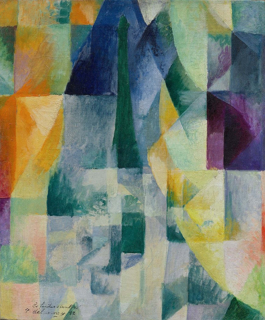
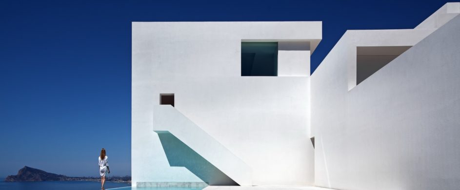
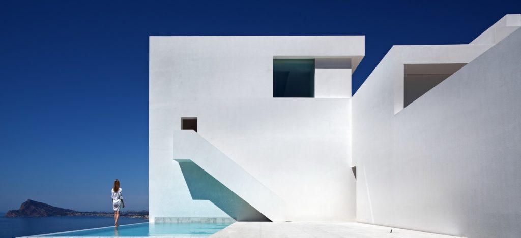
From the white cubic houses in Cyclades to the colourful villages of Cinque Terre, from Burano, to Copenhagen and to the blue streets of Morocco, color is dominant, tense and vibrant. Leaving behind all the color theories developed in the 20th century as well as the mystical or symbolic associations with natural elements (e.g. blue associated with sky and water, yellow with sun and light, red with blood and fire, brown with earth) and their psychological stimulations to our human behavior, I would like to emphasize in this indefinable virtue of an architectural work that by using color properly can evoke in our minds feelings, thoughts and emotions.
///
Dalle bianche case cubiche delle Cicladi ai colorati paesini delle Cinque Terre, da Burano, a Copenaghen e alle strade blu del Marocco, il colore è dominante, intenso e vibrante. Lasciando da parte tutte le teorie sul colore sviluppate nel XX secolo e le associazioni mistiche o simboliche con elementi naturali (ad esempio blu associato a cielo e acqua, giallo con sole e luce, rosso con sangue e fuoco, marrone con la terra) e il loro stimolo psicologico al nostro comportamento umano, vorrei enfatizzare questa indefinibile virtù per un’opera architettonica e il fatto che, utilizzando correttamente il colore, si possono evocare nella nostra mente sentimenti, pensieri ed emozioni.
Often, architects and we students of architecture when realizing a project, we think of the color as an ‘additive’, something that we can add subsequently, as a factor of emphasis. But in reality, color should be perceived from the beginning of the project, as a natural fact: From Alvaro Siza to Peter Zumthor, this naturalness refers to the use of indigenous materials and to the techniques that are linked to the environment where each project is located. The analytical methodical approach of each architect is different and should be studied according to his background and his beliefs. For example, even in Mexico, where it is very difficult to be an a-chromatic architect because color is consolidated through centuries of architectural tradition, Barragan and Legoretta still use the color differently: The first, linked piously to his Mexican roots, the second with exuberant colors, affected much more from the concepts of modernism.
///
Spesso, architetti e noi studenti di architettura quando realizziamo un progetto, pensiamo al colore come ad un ‘additivo’, qualcosa che possiamo aggiungere successivamente, come fattore di enfasi. Ma in realtà, il colore dovrebbe essere percepito fin dall’inizio del progetto, come fattore naturale: da Alvaro Siza a Peter Zumthor, questa naturalezza si riferisce all’uso di materiali indigeni e alle tecniche che sono legate all’ambiente in cui ogni progetto si trova. L’approccio metodico analitico di ciascun architetto è diverso e dovrebbe essere studiato in base al suo background e al suo credo (ideologie, pensiero, ideali). Ad esempio, anche in Messico, dove è molto difficile essere un architetto acromatico perché il colore si è consolidato attraverso secoli di tradizione architettonica, Barragan e Legoretta usano ancora il colore in modo diverso: il primo, collegato in modo devoto alle sue radici messicane, il secondo con colori esuberanti, influenzati molto di più dai concetti di modernismo.
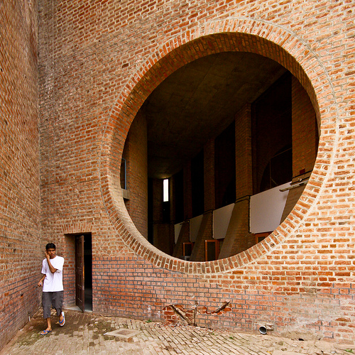

color and materiality in the work of Louis Kahn and Tadao Ando (The Indian Institute of Management - The Church of light)
Other architects that use the pure color of materials are Louis Kahn and Tadao Ando for example. Their architecture is naked, but harsh, reminding us that bricks and concrete can be silent, but highly expressive. Tadao Ando’s concrete surfaces reveal subtle imperfections of hand formwork: seam lines, gradations of color and texture.
///
Altri architetti che usano il colore puro dei materiali sono Louis Kahn e Tadao Ando per esempio. La loro architettura è nuda, ma dura, ricordandoci che mattoni e cemento possono essere silenziosi, ma altamente espressivi. Le superfici in cemento di Tadao Ando rivelano sottili imperfezioni delle casseforme a mano: linee di giunzione, gradazioni di colore e consistenza.
 by Ricardo Bofill")
 by Ricardo Bofill")
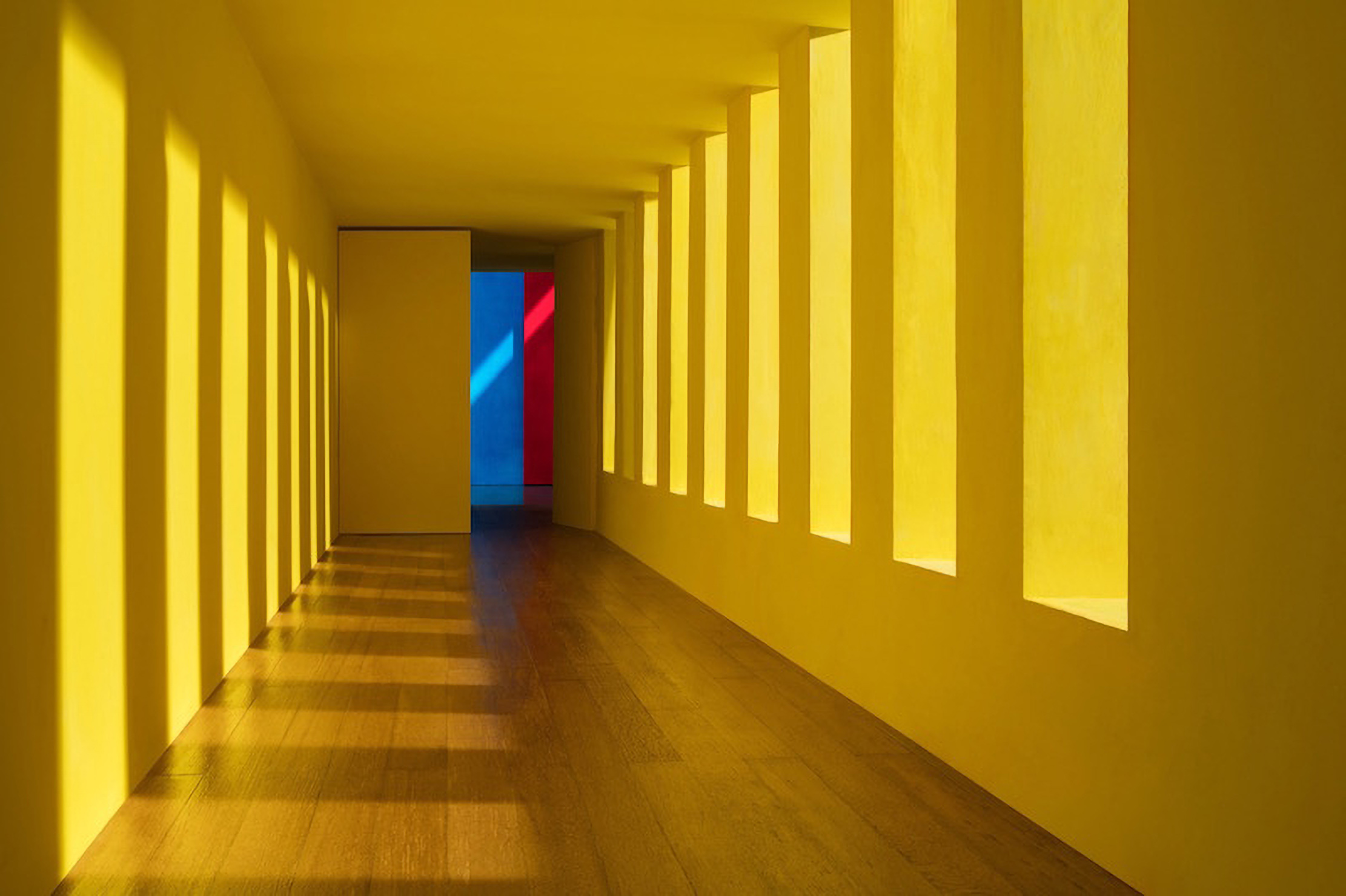
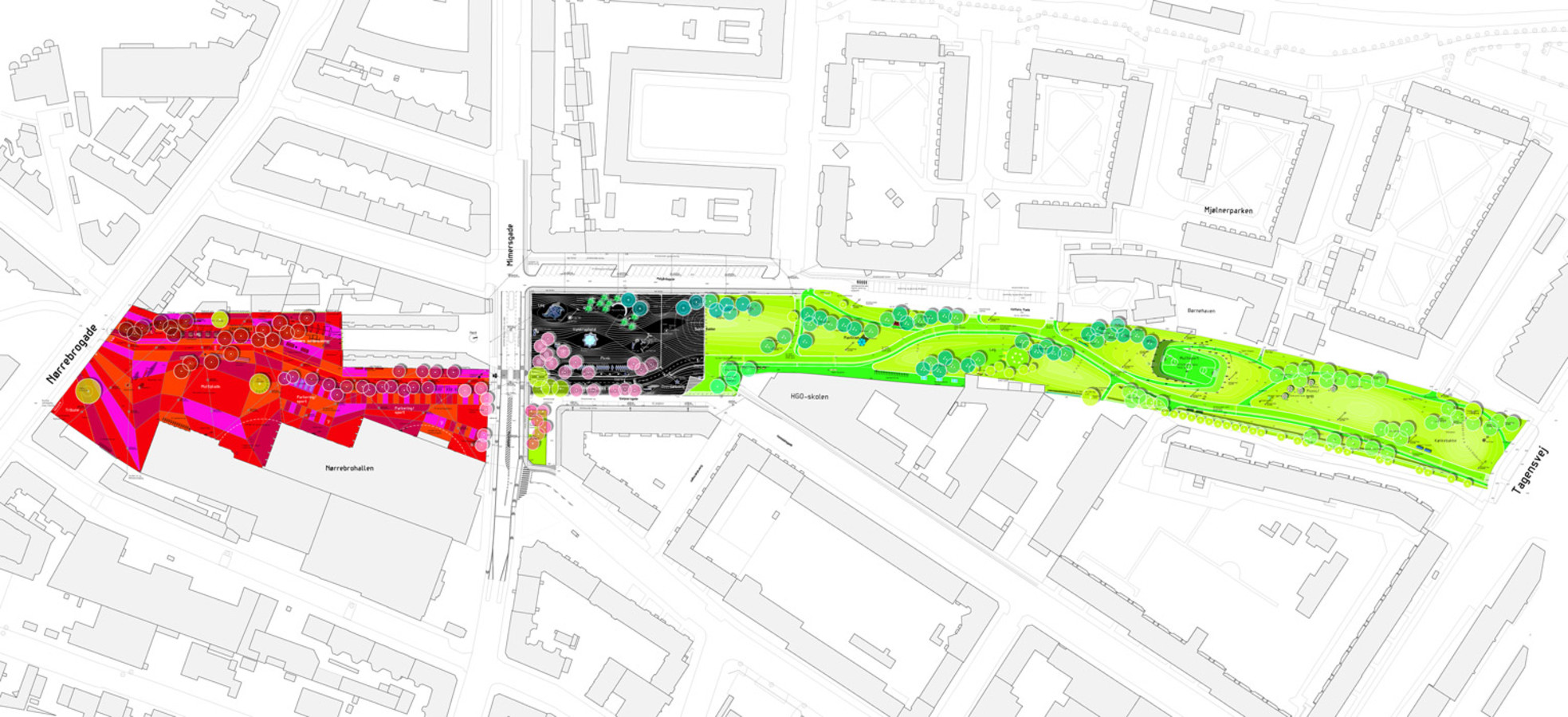
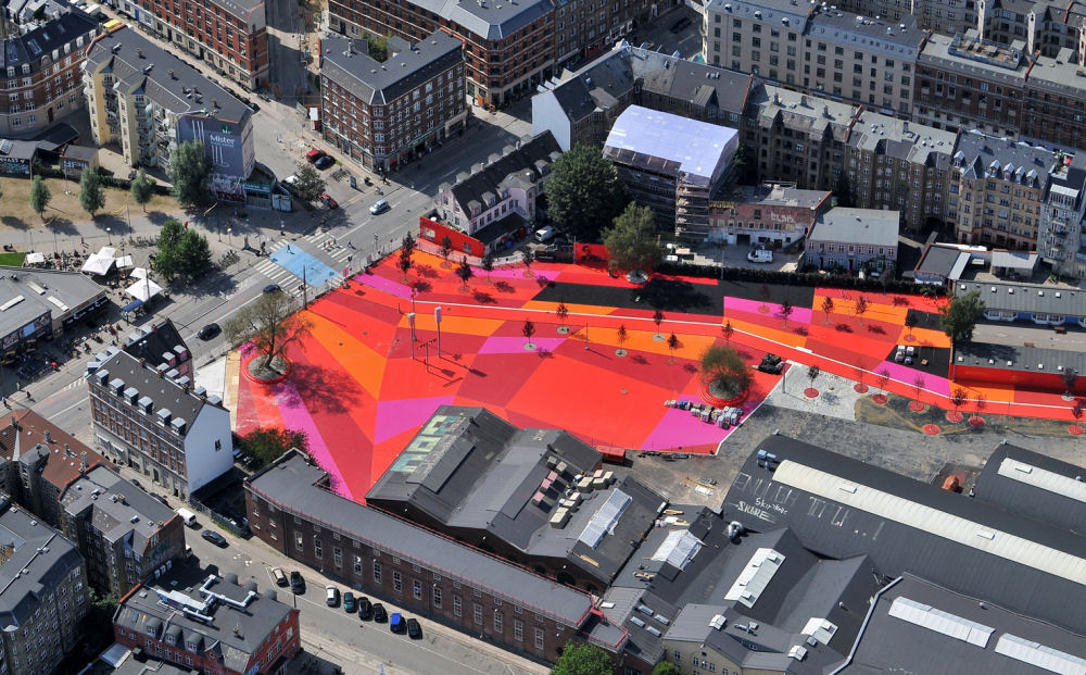
Whether color is used to cover hole surfaces, like walls, floors or ceilings as done by Ricardo Boffil in Muralla Roja, or it is used to underline architectural details, as observed in the work of Lina Bo Bardi, color is an integral element in architecture; it is not only important aesthetically, but it also has a great psycho-sensory importance. That is why lately it is frequently used in projects that deal with children, like ‘Els Colors’ kindergarten by RCR, or projects that have to do with health, like ‘Nemours Children’s Hospital’ by Stanley Beaman & Sears. Last but not least, color may be used in urban projects. An example can be the Superkilen park in Denmark, designed by BIG Architects, Topotek 1 and Superflex. The half mile long urban space is divided in three zones marked by three different colors, green, black and red, each one serving a different purpose (the green park-the black urban living room and the red square).
///
Se il colore è usato per coprire le superfici dei fori, come pareti, pavimenti o soffitti come ha fatto Ricardo Boffil in Muralla Roja, o è usato per sottolineare i dettagli architettonici, come osservato nel lavoro di Lina Bo Bardi, il colore è un elemento integrante dell’architettura; non è solo importante esteticamente, ma ha anche una grande importanza psico-sensoriale. Ecco perché ultimamente è
frequentemente utilizzato in progetti che riguardano bambini, come la scuola materna “Els Colors” di RCR, o progetti che hanno a che fare con la salute, come “Nemours Children’s Hospital” di Stanley Beaman & Sears. In ultimo, ma non per importanza, il colore può essere utilizzato nei progetti urbani. Un esempio può essere il parco Superkilen in Danimarca, progettato da BIG Architects, Topotek 1 e Superflex. Lo spazio urbano lungo mezzo miglio è diviso in tre zone contrassegnate da tre colori diversi, verde, nero e rosso, ognuno dei quali serve a uno scopo diverso (il parco verde, il salotto urbano nero e la piazza rossa).
Taking into consideration all the examples above, as well as the expressive power of the colors themselves, we conclude that an architect should consider the color effect of every element of a building’s construction, from the earthy colors of primary construction materials like wood, stone, brick and marble, to the expansive variety of colors available for paint, doors, windows, siding, and trim. This sensitive approach should also expand in terms of managing the urban fabric of our cities, which undoubtedly, has direct affect on the fabric of our souls.
///
Prendendo in considerazione tutti gli esempi sopra, così come la forza espressiva dei colori stessi, concludiamo che un architetto dovrebbe considerare l’effetto cromatico di ogni elemento nella costruzione di un edificio, dai colori terrosi dei materiali da costruzione primari come il legno, la pietra, mattoni e marmo, all’ampia varietà di colori disponibili per vernici, porte, finestre, rivestimenti e finiture. Questo approccio sensibile dovrebbe anche espandersi in termini di gestione del tessuto urbano delle nostre città, che ha indubbiamente un’influenza diretta sul tessuto delle nostre anime.